Dora Maar exhibition.
|
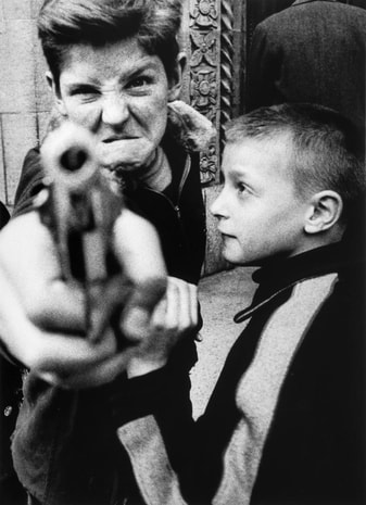
On the 26th of January, for my Dads birthday, me and my family went to the Dora Maar exhibition at the Tate Modern. To be perfectly honest, I wasn't that impressed. I can respect that she was a revolutionary, early 20th century Photographer and Artist who worked with the likes of Picasso, but I didn't admire her work as if it was amazing. I thought her pictures were average in my opinion. I did like a few of the adverts she did such as the girl behind a cobweb, which was for an anti-ageing product, and a few of her street photography pictures such as the man with his head in a hole. However, I did not like her collages at all as they were meant to look out of place but I thought the look she was going for was unclear and they didn't engage me into her work. Also, most of her street photography looked amateur to me. They normally consisted of one person doing a normal act with no meaning behind it. Overall, it was a decent exhibition but I didn't think her work was very good, simply put. Maybe it's just me and only I don't like her work but it seems not that way as I have tried to interpret her pieces in different ways but always end up giving her work a low rating. I expected more from someone who was so highly rated by the likes of Picasso.
|
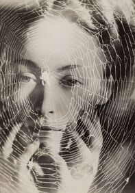
The cobweb advert.
|
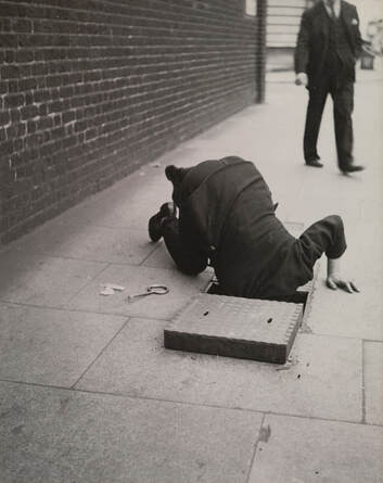
The man with his head in a hole.
|
Photographer Gallery.
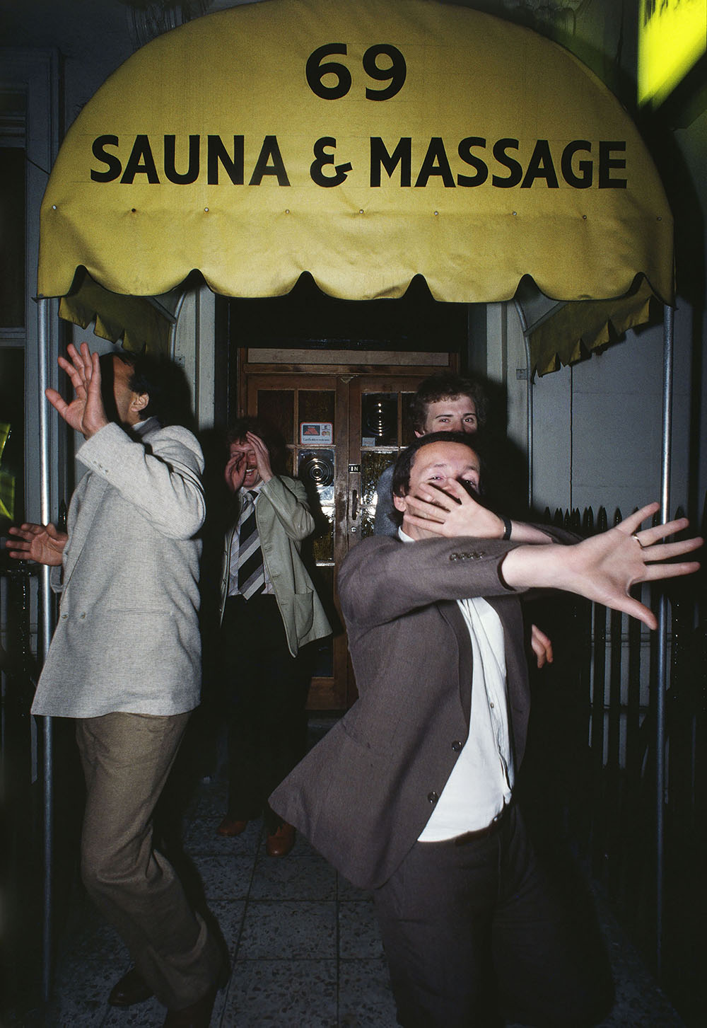
During the February school term both photography classes visited the Photographer's Gallery in Soho. This was an amazing gallery with artists such as Kelvin Brodie, Corinne Day, Clancy Gebler Davies and many more. The gallery consisted of 3 floors with 3 sections: Early Pictures of Soho, Food, Contemporary Food.
|
The first section, Early Pictures of Soho, consisted of photographers doing mainly street photography of the Soho area and what the scene was like in the 50's and 60's. Night clubs, gay bars and strip clubs were all very popular and common in the area at the time. Some of these are still here today but don't have near the attraction as they used to which is shown in some of the photos taken by the likes of William Klein and others.
|
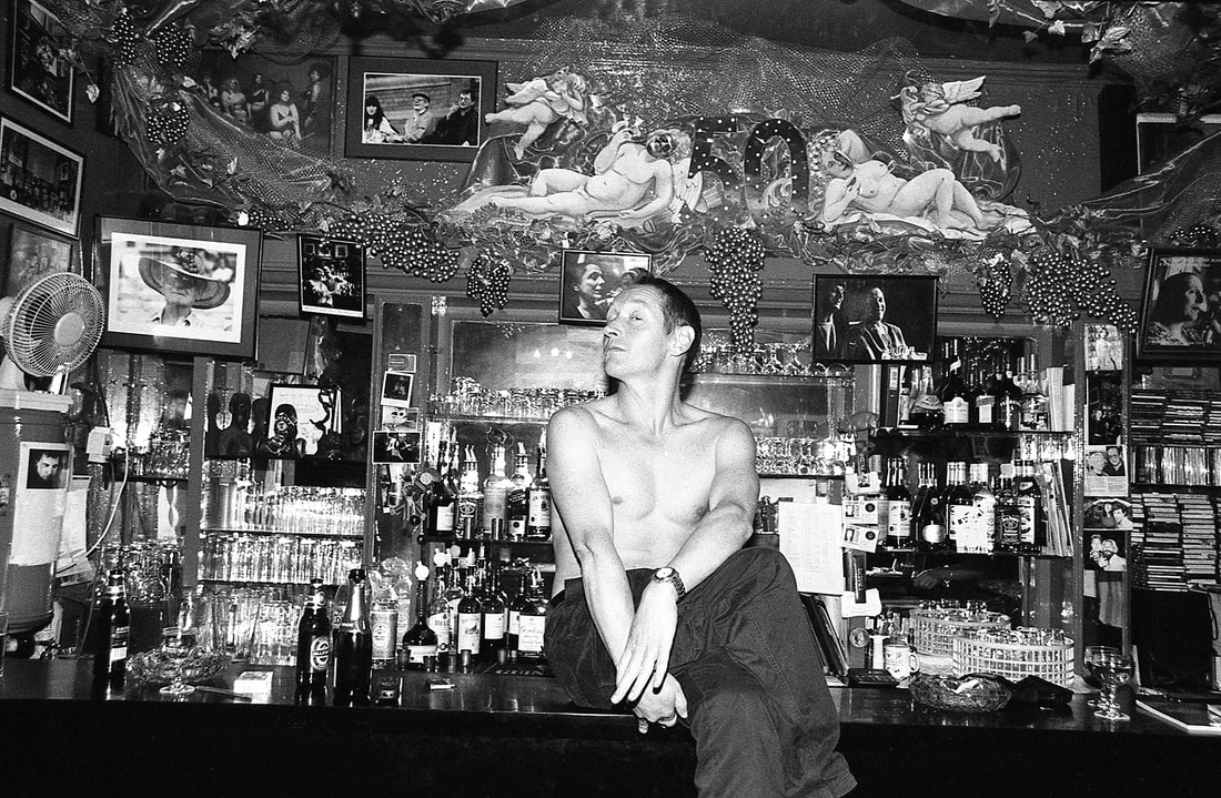
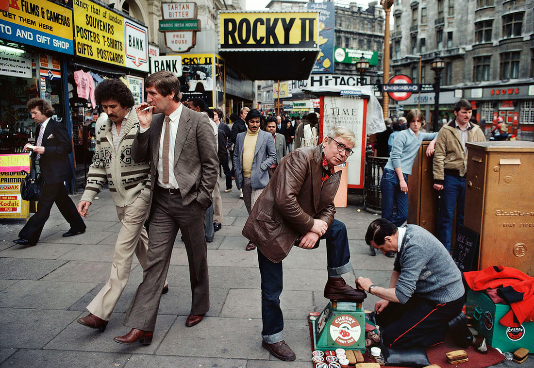
Gay man celebrating a pub's 50th birthday -
William Klein.
|
|
The 'Food' area showed food that had been captured to be interpreted as something else such as Edward Weston's 'Pepper No. 30' which showcases a pepper seemingly showing off its muscles. The pictures in this section were mainly black and white to show the contrast and shadows of the food and were primarily of fruit and vegetables as a deformed version of a fruit or vegetable could be interpreted in a very different way.
|
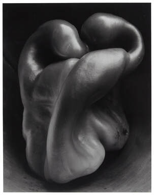
Pepper No. 30 - Edward Weston.
|
|
The last section, Contemporary Food, was full of very colourful foods and rather rude interpretations. These pictures were taken at the mid 20th to late 20th century making this section very interesting and intriguing as the world went through such big changes at those times. The section showcased some interesting cook book's which had very vibrant foods(so bright it would make you feel sick) and interesting recipes such as spam in a fruit salad. Artists such as Martin Parr and Cindy Sherman featured in this section and showcased food in a number of ways.
|
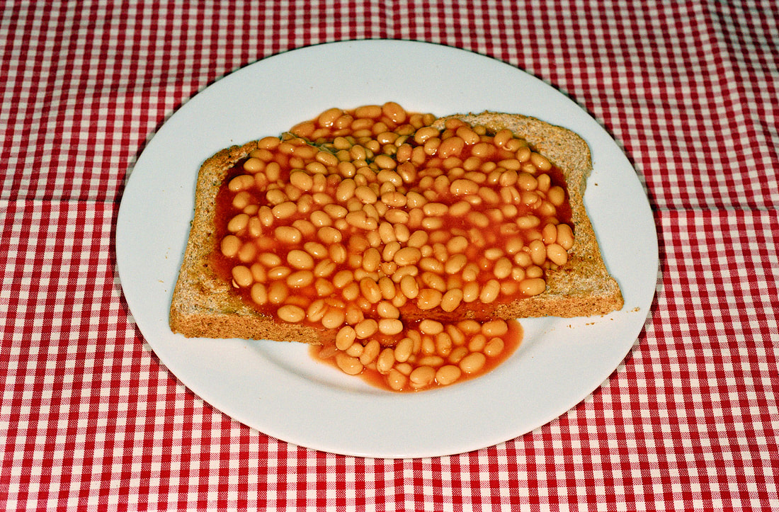
Beans on toast - Martin Parr.
|
My favourite images from the gallery.
|
|
|
|
|
Broken photos from the gallery.
|
I think this photo shows 'broken' quite literally as it looks like the man has no head. The contrast from the light of the car and the black and white filter adds a very comprehensive effect but the absence of the woman's face and the man's head make the image seem incomprehensive and broken.
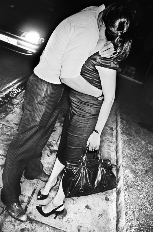
Soho 2011 - Anders Petersen.
|
Once again, for this picture, the subjects face is cut out of the picture like it's missing and separated. The composition in this picture is strange as the woman's head is more visible than the mans head in the other picture, as we can see her hair, but, her forearm is exactly where the face of the man outsides face would be. Aswell as this, the composition of the picture also means we only see one corner of the room and not the whole room possibly adding onto the effect that the woman is in a tight squeeze to escape out the window. This photo shows 'broken' because of its non-appearance of faces and it's improvised and cut-off composition.
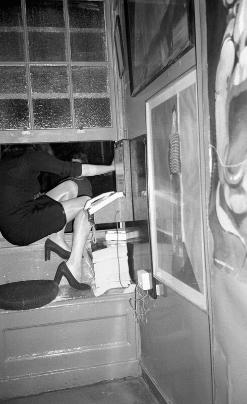
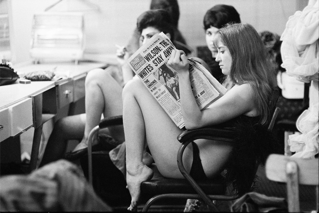
The Colony Room Club, 1999-2000 - Clancy Gebler Davies.
|
You've written really great reviews of all three exhibitions you've been to see, Magnus. As you've chosen Broken for your theme, why don't you select your favourite images from these shows that represent 'Broken' and explain why.
Broken strands.
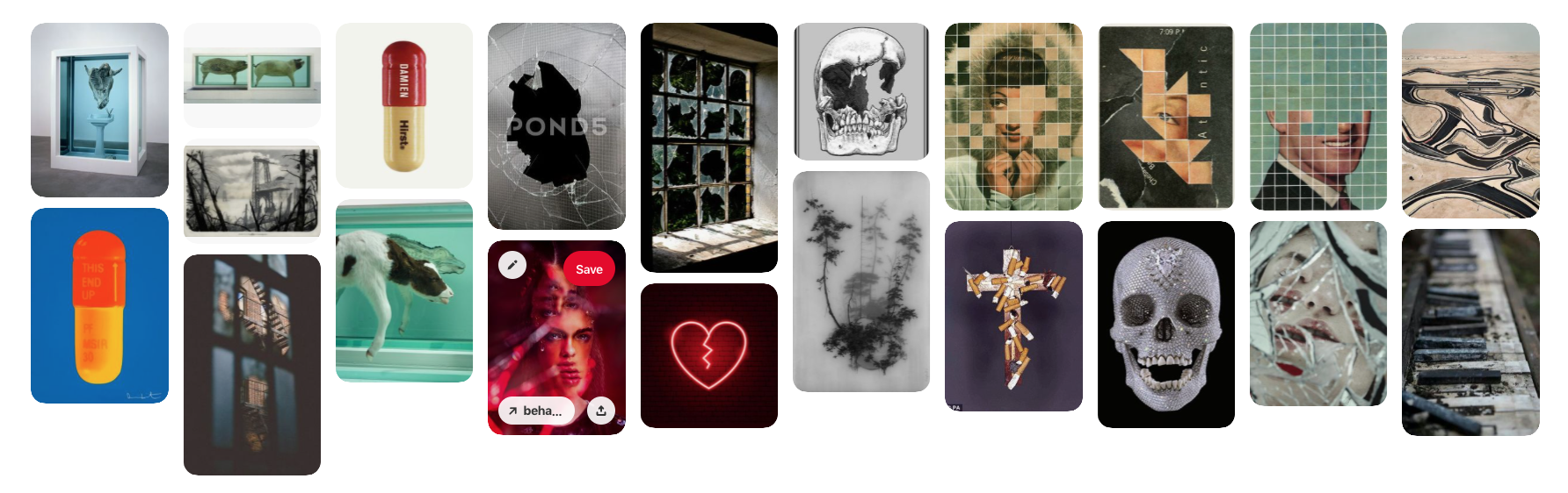
For our first unit 2 task we had a choice of 3 themes to pick from: broken, extreme contrast and domestic objects. I chose broken because the variety of pictures I saw was diverse and how many different interpretations of the word there are. Could mean mentally broken, physically broken and in humans or inanimate objects. From broken windows to broken hearts and animals being chopped in half. For me it was the most interesting theme of the 3 which is why I chose it.
My inspirations.
My inspirations for this task are photographers who independently show 'broken' in their work. They are as follows:
- Damien Hirst
- Micheal Wolf
- Andreas Gursky
- Anthony Gerace
- Damien Hirst
- Micheal Wolf
- Andreas Gursky
- Anthony Gerace
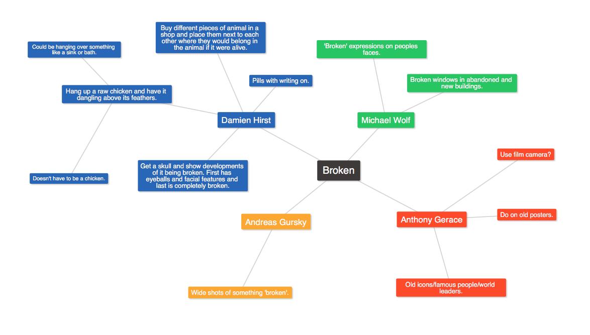
For our first task we were to complete a shoot were we would create images that were similar to the images done by the Photographer/Artist that we saw. I decided to pick Michael Wolf, Anthony Gerace and Andreas Gursky as I had a Damien Hirst idea I wanted to go with for my final piece. I recorded all of my ideas in a mind map to show my thought process of certain pieces.
My ideas.
Anthony Gerace.
|
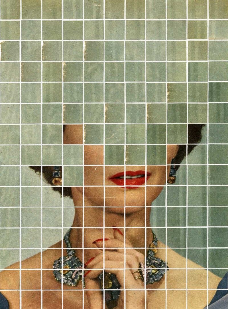
My first Photographer I analysed for my broken theme was Canadian Anthony Gerace. Working and living in London Gerace's work is said to be "primarily concerned with the effect of time on objects and images", which is clear to see in his 'People Living' project which consists of multiple collages created from one page of a vintage magazine from a time in his life. In his work he combines photography, typography and collages to which he didn't know how to combine them at all at the beginning but learnt by starting with just collages which led to poster design and that led to graphic design and so on. His inspirations originates from people being so invested into their work as he quoted "there was a summer where I spent every single day at my friends’ studio, and seeing how they lived, and how their work was in everything they did, was really inspiring".
I like Gerace's 'People Living' collages as they can be interpreted in many different ways ranging from who the person was and their problems, or deception, or deformity and so on. It doesn't have a clear message and is to be interpreted how you want to see it. Specifically, the picture on the right eliminates the top half of the woman's face adding an effect of concealed facial expression. We can see the woman's hand near her face and her mouth slightly open possibly implying a feeling of shock or worriedness but because we can only see half of her face, we don't know what she's feeling. Gerace cuts off the image at certain points only giving us hints to the meaning of the picture. Really thorough artist research section, Magnus! Can you annotate the photo on the right, describing it specifically and explaining what kind of effect's been created by the artist by displaying the deconstructed image in this type of a grid? |
|
Outcome.
Below, is my outcome of the Anthony Gerace 'People Living' task. My intentions for this task where to copy Gerace's images whilst still sticking to making the image look old whether that meant editing it or just getting an old picture in the first place. I'm happy with the outcome as my images look very similar to the originals. I edited it by (insert how u got to the grid) and then I cut out squares of the background using the square selection tool, cutting out the same size as each square on the graph, and copy and pasting the cut-outs onto the face of the subject making sure, in some cases, that the cut-outs match with the background (which I didn't execute perfectly). These all formed together to create my Gerace images which make this picture of someone being cut up or slowly fading away in chunks. I liked this project however it wasn't my most favourite as there is only so much you can do with this exact project but is possible to expand into his other works which I don't find as exciting.
|
I edited this image by first cropping and rotating the image so the parts of the picture I didn't need were cut out and the image was straight. I then placed a grid on top of the picture by going to view>show>grid. If I were to save the image as it were, the grid wouldn't show up so I drew lines over the grids lines, using the shapes tool and selecting lines, so when I removed the grid, the image would have a grid that would show up when I saved it. I then cut out ares of the background using the rectangular marquee tool and then copy and pasting, cmd v and cmc c. I would only place the section of the background I cut out in the same column from the grid I got it from so when I placed it over the subject, the background would line up. I repeated this many times copy and pasting the same section of background and doing the same for other sections of the picture. The final result you see is multiple ares of the background placed over the subject to complete a Gerace image.
|
Original image.
|
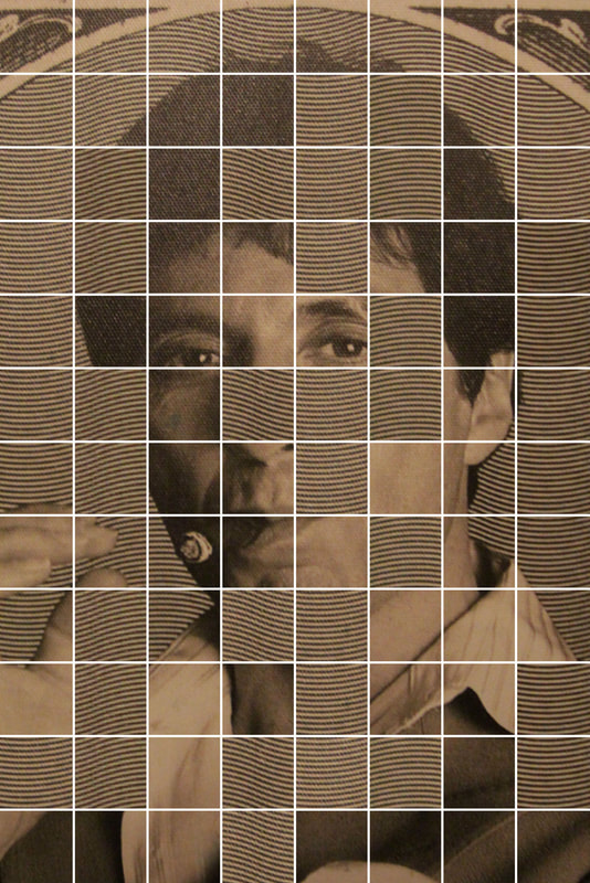
In conclusion, I'm happy with the final outcome of my picture. This task was probably the hardest to complete as the background caused me a lot of difficulties because I wasn't able to cut out some of the background so some columns in the grid don't have any squares covering them. I enjoyed this task and would improve on it next time by producing more images and filling in more squares.
Great example! Can you show the original image you've used and demonstrate how you created this?
Damien Hirst.
My second Artist remove and write artist - it's ok... I analysed is Damien Hirst, someone who is not a Photographer but an Artist. Hirst was said to have "dominated" the UK art scene in the 90's is reportedly the richest living UK Artist with him being worth £215m. Hirst wasn't at first accepted into the art scene as he got an E in A level Art and was rejected by both his college and his university at first but was accepted by both after as he had successful foundation courses at both.
|
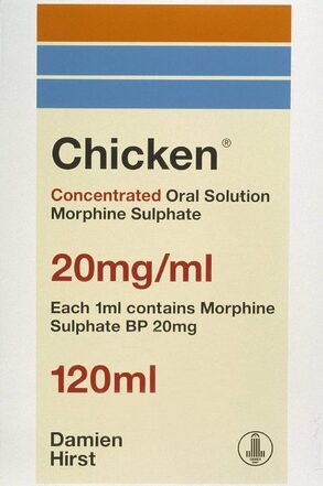
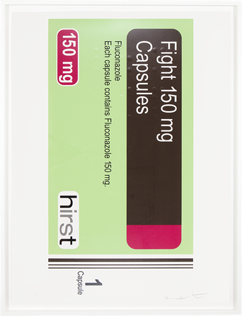
The piece of Hirst's I am focusing on is his work on medicine. In 1989, he made 12 cabinets full of all kinds of medicine naming them after each title of the songs in the Sex Pistols' first album ('pretty vacant', 'liar', 'sinner' and so on). His reasons for using medicine as art is that he thinks 'art can heal like a pill or medicine does'. When Hirst was questioned "Art can heal?", he replied with "I think the thing that is forgotten is that we are going to die… They can only heal you for a minute. When they are giving you drugs to keep you alive there is a point where you have got to say its not worth it, I think". Aswell as his cabinets work, he also rebranded some medicine packaging changing the name to British foods such as 'sandwich'. In this work, Hirst once again explains that all humans are going to die eventually and we can't depend on drugs to 'heal' us. In the actual cabinets themselves, are empty medicine packages and bottles etc, which Hirst calls "empty f*cking vessels", allocated to the different organs in the body for example, the heart. The cabinets are meant to portray the human body and they 'explore the distinction of life and death, myth and medicine'. He's asking 'does it actually help?' and to that I sort of agree as death is unavoidable but medicine helps with not dying earlier and instead dying later.
I like this work the most out of all his medicine work as Hirst takes the mick out of some medicine and their companies whilst still looking clean and proffessional. |
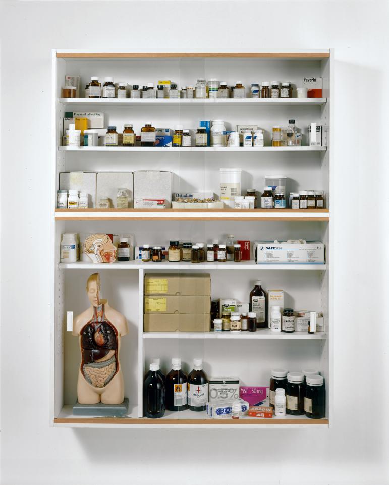
Damien Hirst's 'Sinner' cabinet.
Describe what's in the cabinet and what it's all about. What are your opinions of this work and why?
|
|
|
Outcome.
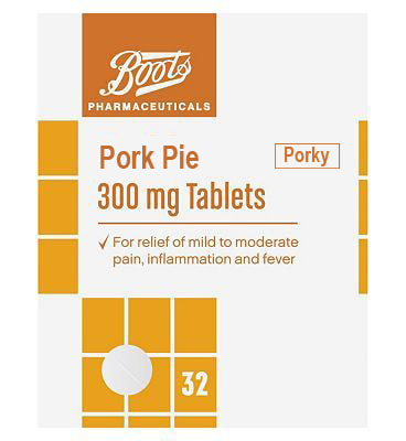
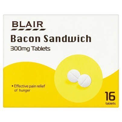
Underneath this text is my final outcome for the Damien Hirst medicine packaging strand. My aims for this task were to create an accurate package that looked realistic but to put a food twist on them. I think I executed the task well although the one thing I could never perfect, for some, was getting the same font or a very similar one. For example in my Bacon Sandwich tablets package, I couldn't fin the same font as the Tesco font nor could I find the same font for the title name so I had to use the next best thing. I would put the writing and title over a rectangle using the rectangle tool which was the same colour as the background using the eyedropper tool and which I covered the original writing with. I would then type in my desired food using the horizontal text tool and even add on some text onto the packaging where I thought suited like "Porky". I think my images are similar to Hirst's however his are much more well done as every aspect of his is done perfectly. Although saying this I really liked this task as it was a challenge for me as out if the three strands this one took the most time and it was the most irritating because of the font situation and the search for a medicine pack that would be good and relatively easy to edit.
Contact sheet.
|

|
|
My final images I thought were successful and were quite similar to Hirst's. I think I used classic British foods well in my edits and I enjoyed making idiots of medicine. If I were to do this again, I would create my own logo and start a medicine box from scratch.
Really clever adaptations, Magnus! You've done a very convincing job - well done! Please follow the format for how to organise your Weebly - your sections are all out of order and make it difficult to follow.Please move all your sections so they follow the below order:
Artist section
Shoot intentions
Contact sheet
Best original images and Edits
Final images
Evaluation
Artist section
Shoot intentions
Contact sheet
Best original images and Edits
Final images
Evaluation
Andreas Gursky.
The final Photographer I looked at was German Professor Andreas Gursky. I have previously researched into Gursky on my environment page and already know what kind of photos he takes. Wide, colourful and large format pictures. His pictures are unbelievable as the colour and quantity combine to create a staggering image.He's taken pictures of shops, stock exchanges, racetracks and many more giving him a variety of very interesting works to look at. The piece of his I am pinpointing is actually all of his work since the 1980's.
|
Probably Gursky's most famous image, and my favourite, '99 cent' was inspired by his fascination in a dollar store window he drove by one in Los Angeles. He came across a very colourful one and decided to take a picture of it. This work has become so famous he even did a related piece 2 years later with '99 cent II, Diptych'. The two pictures are of two different stores but are both very similar to the original apart from the change in colour which shows a change in mass production and marketing in the last few years.
Gursky's pictures attract to me a lot because of how interesting they are as you would've never known something like a dollar store could be portrayed as a very positive and colourful place. His images don't portray 'broken' at all really, in fact they're almost the opposite. Because of his composition and his use of the wide shot, nothing is meant to be cut out of the image as he captures a wide shot in every one of his pictures. Although saying this, few of his images hint at broken like 'Bahrain I'. Nonetheless, I love his pictures and my favourites are the '99 cent' pictures to which I wish to recreate these images in my work. Why is his work in the Broken theme? Explain how it relates to this or does it? It's ok if there's something else about the images that you'd like to use but if so, say so. |
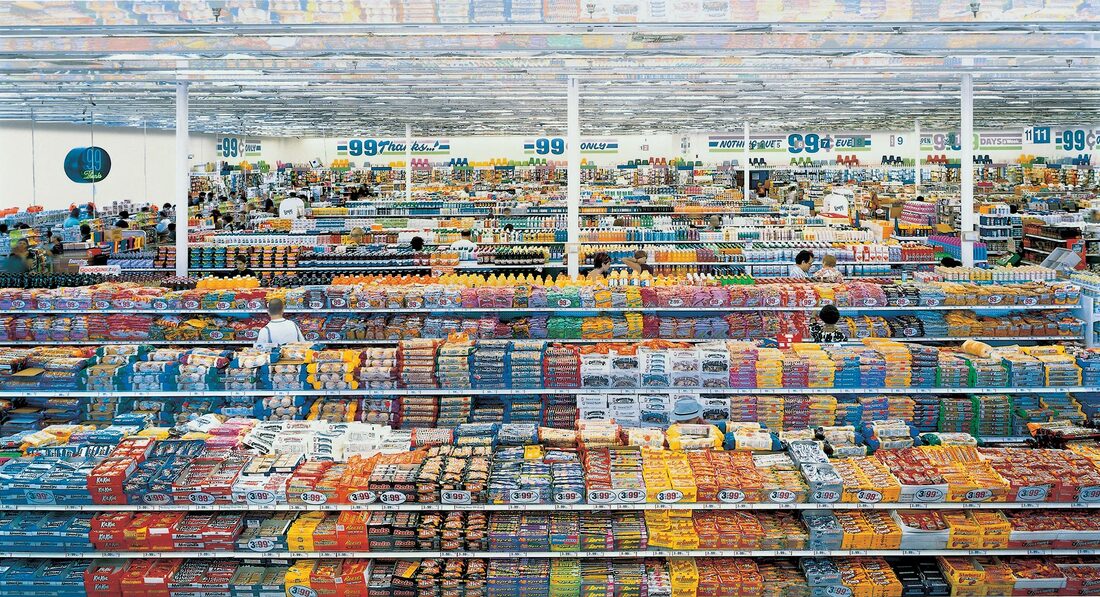
99 cent.
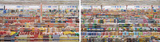
99 cent II, Diptych.
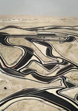
Bahrain I.
|
Outcome.
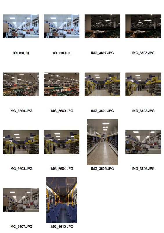
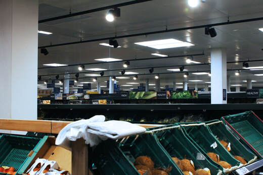
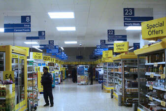
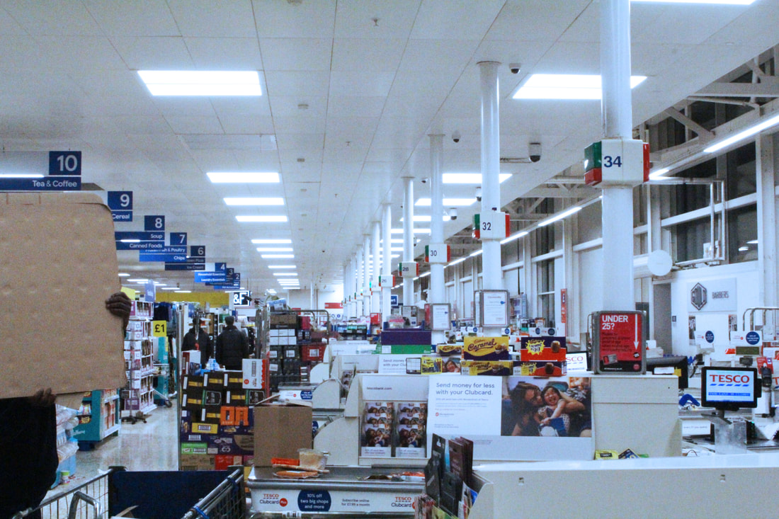
These are my Andreas Gursky pictures. My intent was to capture a collection of images very similar to Gursky's and the first step was to think of a place where there was a lot of some things. For where I live I thought that a supermarket was a good place to go and what better place to go than Tesco Extra in Barnet. This Tesco is one of the biggest in London and is open almost 24/7 so I went late at night where it was basically derelict bar the workers. The outcome of one or two images is exactly what I wanted. I wasn't able to capture the same colour as Gursky but I think my images are close-looking to his. I edited my images by firstly fixing the brightness and contrast then increasing the saturation and vibrance to boost the colours like Gursky. I then applied a cooling filter which some of Gursky's images have because of the year they were taken in and therefore the quality of image. Overall, I think that the final outcome of this work was similar to some of Gursky's pictures' aspects however there are are a few missing like more things to see and this may be because of Gurskys's images been taken up high or that he knows more places where a lot of something is.
Contact sheet.
|
|
|
Overall, I think my shoots were successful in gaining some kind of exaggerated repetition. I didn't get the same scale as Gursky but my images hold the same ideas. It is unfortunate at the time I didn't think to capture multiple images and then put them next to each other to look like one massive picture but I'm happy with the outcome. (I don't know why the middle picture came out fuzzy).
The main concept in Gursky's work is that he's showing extreme versions of what he's shooting - the multitudes of repetition. Is there any way that you can do that by creating a single image with multiple images from above, so that the final image doesn't look edited?
Favourite strand.
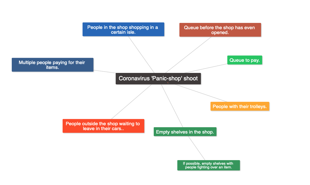
My favourite strand out of the three I captured is the Damien Hirst strand. I loved the concept of turning medicine into a joke and creating them was satisfying and involved creativity. Now that the coronavirus is here, I think it is appropriate to develop further into his medicine side. My ideas for a shoot conveying the recent covid-19 crisis were originally to create custom stickers and place them on medicine bottles with medicine for the virus but I decided to scrap it as it wouldn't have involved photography at all. So I thought that I could capture a picture, not like Hirst's but in fact like Gursky's, of people doing their 'coronavirus panic shop'. A wide angle of people being selfish in such an odd disease in this day and age could be a very powerful image. However, as I am writing this I am strictly not allowed to leave my house and this is not doable for me. Hopefully i will be able to capture this soon so I can upload it.
My ideas.
Great ideas, Magnus - now, let's see your work!! Please put your first 3 projects directly under the individual artists' sections you're referencing.
