Persevere in order to achieve the best possible photograph. Really scrutinise them through your annotation if they fall short of expectations and make the improvements you identify.
Be more ambitious in your responses to briefs set. Go to exhibitions- this will give you a breadth of references to try out yourself.
Be more ambitious in your responses to briefs set. Go to exhibitions- this will give you a breadth of references to try out yourself.
Good, bad and ugly
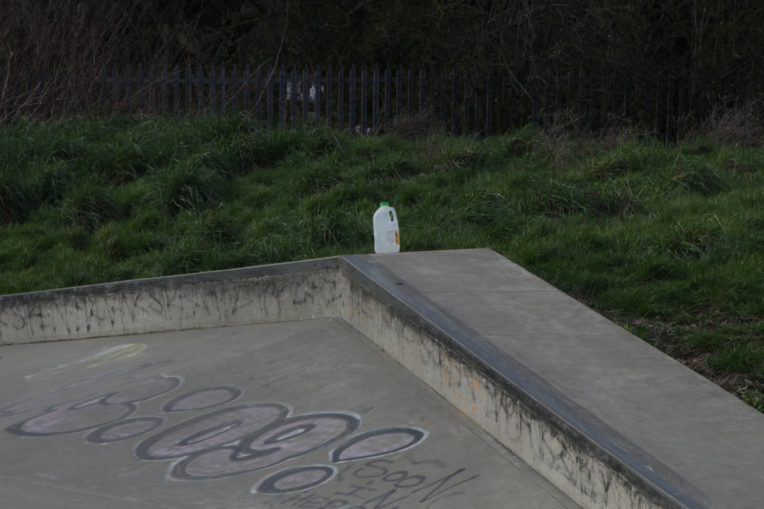
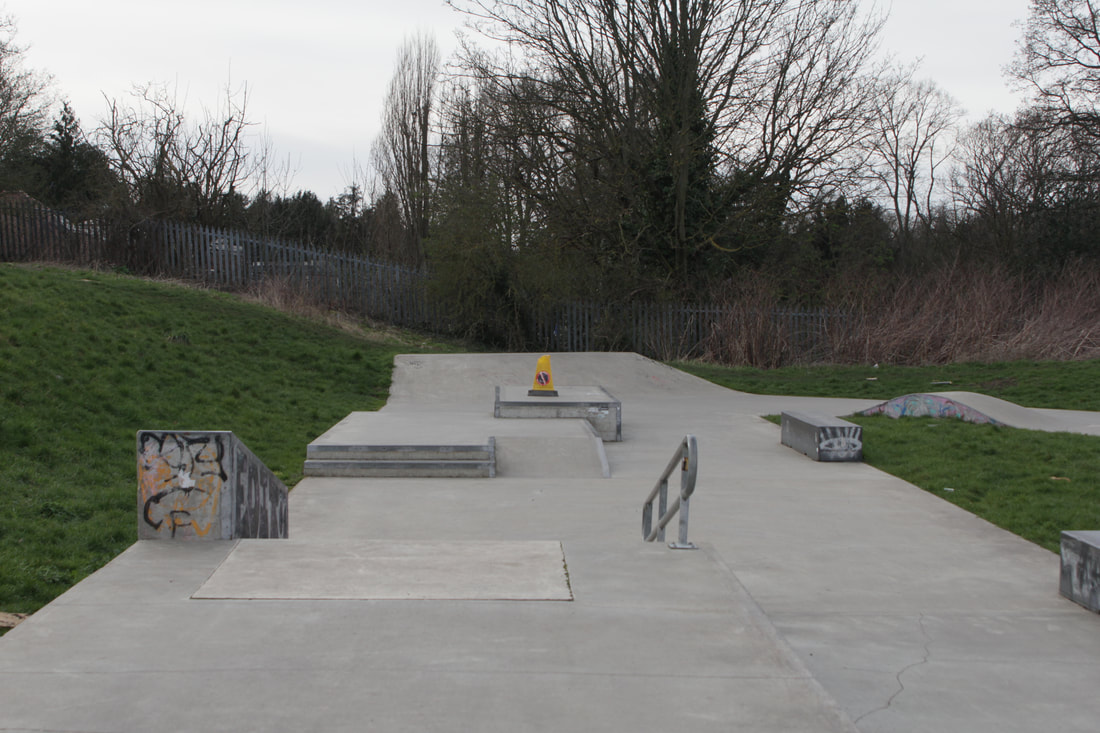
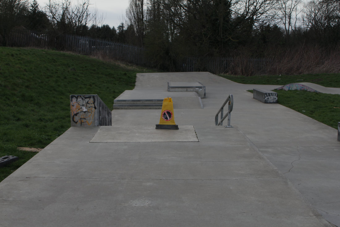
In good, bad and ugly we had to take a variety of pictures under the given title of good, bad or ugly. As you can see I didn't take enough pictures but I mainly tried to focus on the impact of people on the environment. I saw alot of different kinds of graffiti from TV characters to people drawing with a pen writing about drugs. For ugly, all the picture are like the aftermath of a new product or when something gets old and is thrown out or just wares down. For bad, they're mainly graffiti of bad things or bad sentences. All of this badness were really annoying to me because it made me question why do something so bad? For ugly, most of the pictures are just things that have just been thrown out or things that have been used and not dealt with. These things are left out in the environment for people to see and people don't want to see these things because they're ugly.
Good.
Bad.
Ugly.
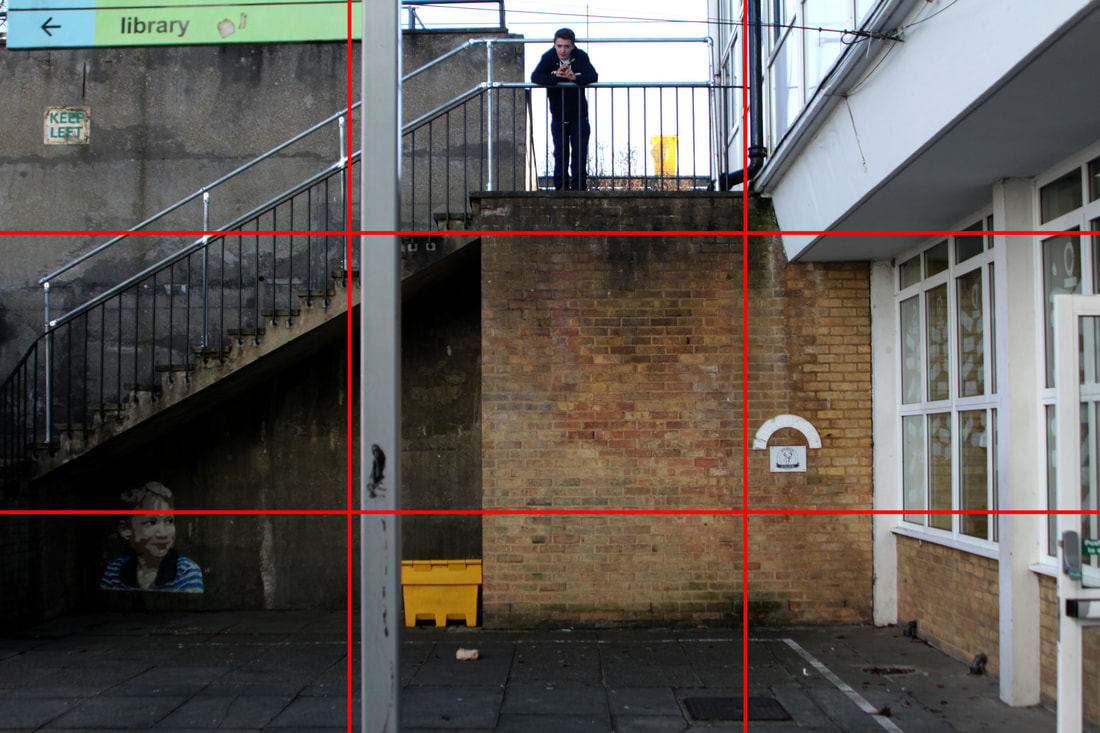
Rule of thirds.
In this task, we were told to try and apply the rule of thirds into our work. We had to place our subject and background on the rule of thirds lines. Rule of thirds is a camera screen divided into nine squares of equal size and this is to obtain a well-composed picture (you can see the rule of thirds grid on the picture on below the slideshow).
CAN YOU SEPARATE THE IMAGE WHERE YOU DREW THE RULE OF THIRDS FROM THE SLIDE SHOW PLEASE //
CAN YOU SEPARATE THE IMAGE WHERE YOU DREW THE RULE OF THIRDS FROM THE SLIDE SHOW PLEASE //
Paul Graham.
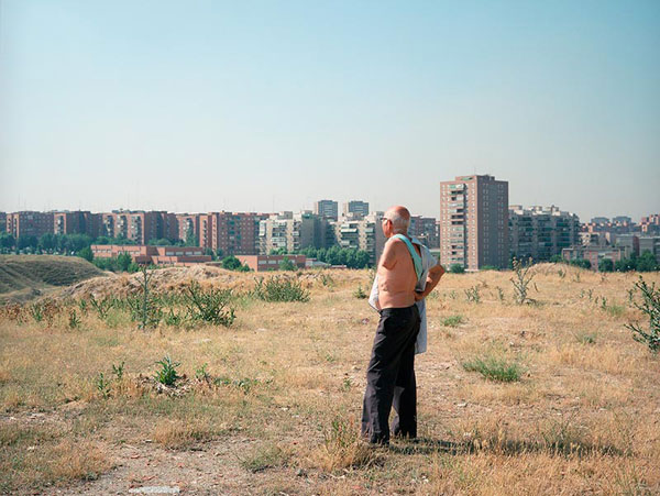
Paul Graham is an English Photographer born in 1956. He's won a few awards such as The Hasselblad Award and Deutsche Borse Photography Prize and he's been successful taking pictures since 1981. He has an autobiography and has many books on his projects like 'Does Yellow Run Forever'. His photos have a title that are linked to the the photos in some way. You'll either have to work out the idea behind the picture like 'New Europe' or it'll be right in front of you like 'Beyond caring'. 'New Europe' can be seen as bad in that Europe has become a wasteland or in a good way in that that old man has seen Europe grow economically with buildings. On the other hand, 'Beyond caring' is clear that everyone in the picture isn't caring about anything at the time they were captured.
New Europe
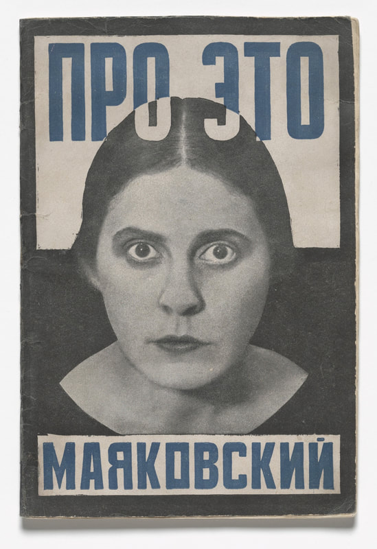
Alexander Rodchenko. |
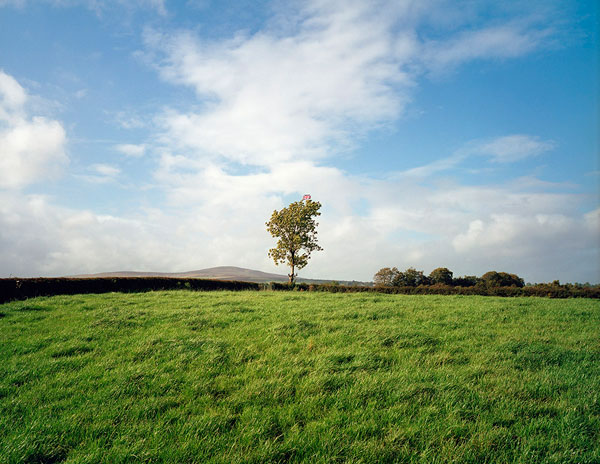
Troubled land
|
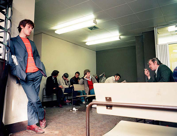
Beyond caring
|
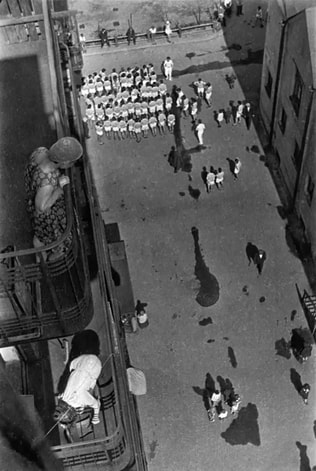
Alexander Rodchenko was a Russian Photographer born in 1891 and dying in 1956. Rodchenko mainly took interesting pictures of people or the Propaganda of Lenin and Stalin. He took a lot of pictures around the Russian Revolution so to me it's fascinating to see how he presents Russia at this time. Down below are Rodchenko's pictures and they might be trying to say 'what is going on in Russia' as in the balcony picture the woman is looking down in confusion at a confusing gathering and in the poster of the lady she seems to be surprised and this picture is in a sort of propaganda like style.
|
|
|
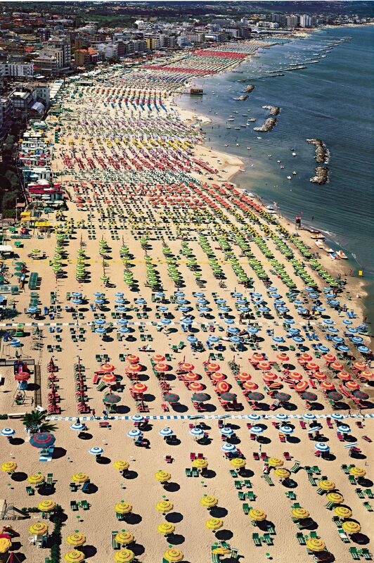
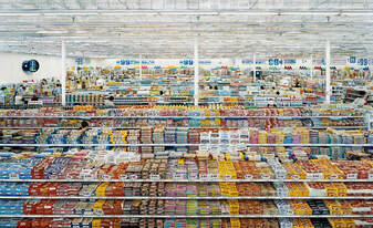
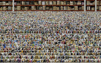
Andreas Gursky.
Andreas Gurksy is a German Photographer born in 1955. Like Paul Graham, Gursky also has been taking pictures from a long time ago (1980) and has won several awards such as the Citibank Private Bank Photography prize and the Infinity Award for Art from the International Center of Photography. However Gursky's style is different to Graham's. Gursky is famous for his wide angle shots and his wide range of colours. His pictures don't usually have a deep meaning and they're just joyous to the eye. Gursky's work reminds me of American filmmaker Wes Anderson as he also uses wide shots and a wide variety of colours in an artistic way.
|
|
|
A really good start to the project. good analysis, thorough annotation and well presented weebly.
Framing the Environment.
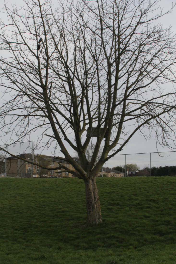
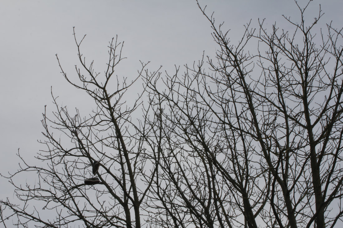
For this task, we were to frame a certain part of the environment and capture just anything that caught our eye. We could use a handheld frame or a natural frame in the environment. I used shutter priority for this task as it was sunny in different parts of the playground and needed to make the picture darker and lighter.
Formal elements.
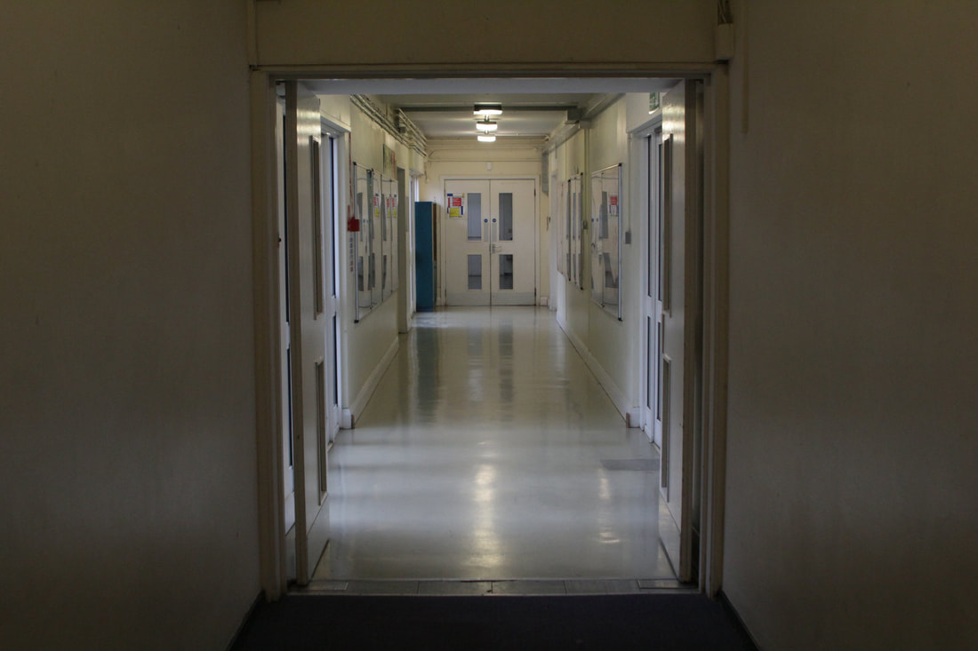
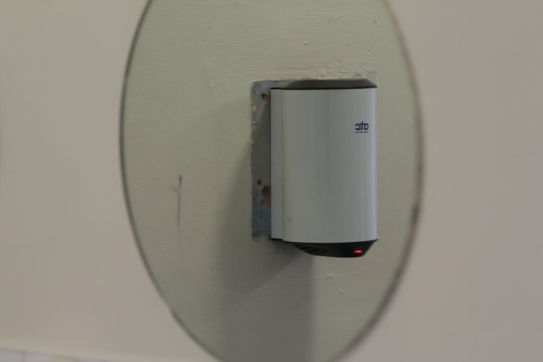
For this task we had to find the different photographic elements. Lines, tone/contrast, colour, shapes/forms, patterns and textures were all found in our playground. Some were alot harder than others for example tone/contrast was alot harder to find than something like colour or lines. I used shutter priority and stayed on 1/60 and put ISO on auto so I could get the appropriate lighting.
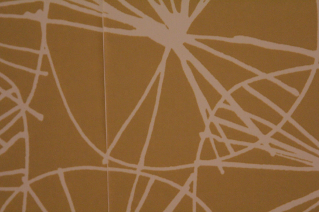
Lines.
Tone/contrast.
Colours.
Shapes/forms.
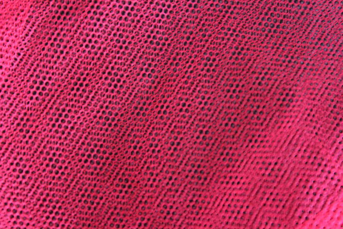
Patterns.
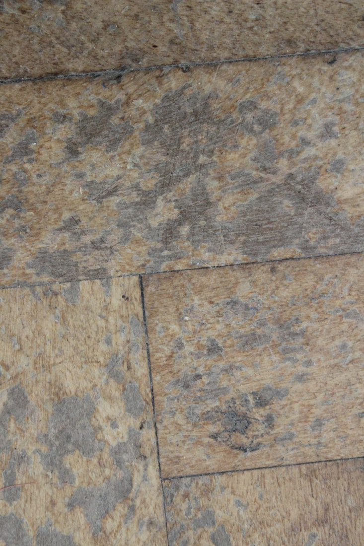
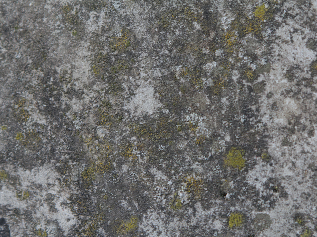
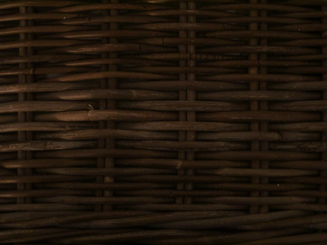
Texture.
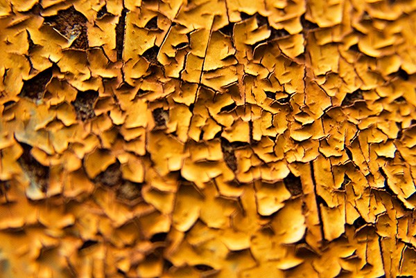
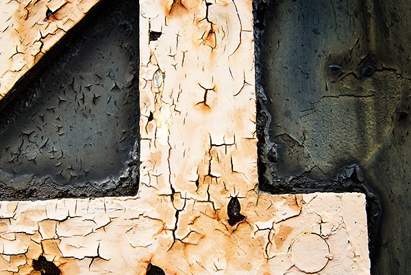
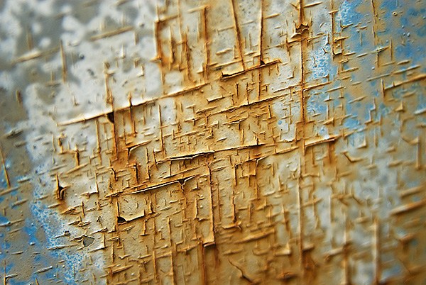
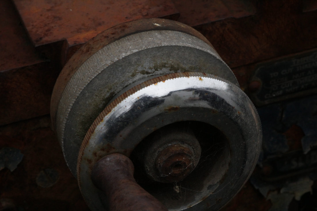
Colin Winterbottom.
Colin Winterbottom is an American photographer who mainly takes pictures of beautiful buildings/structures and landscapes and makes them look very dramatic. He grew up in Washington suburbs and has lived in the city for over 20 years. In this project, he took up close and abstract pictures of things like rust and paint that's been peeled off. Aswell as this, he also creates short films and time lapses and, has received awards such as an award from Black and White magazine.
|
|
|
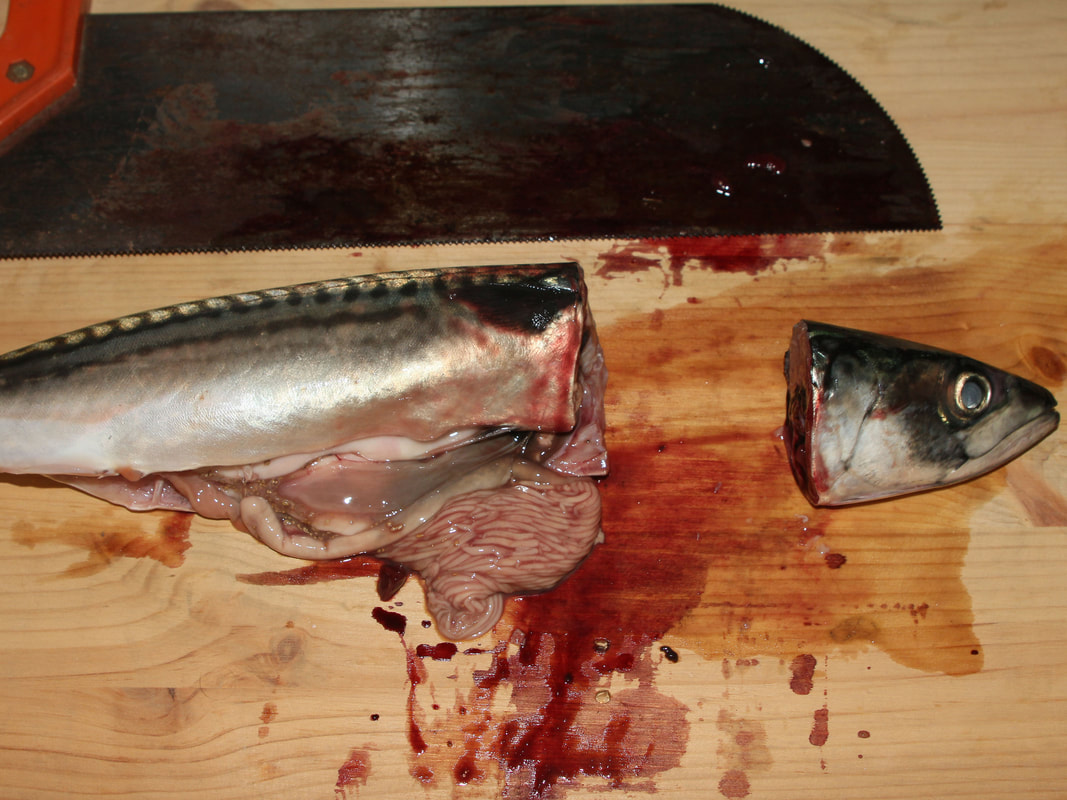
In my pictures below, we went to an art classroom and took some up-close pictures like Winterbottom. It was quite hard to capture up close abstraction in the classroom but we managed to find some good things to capture up close. I captured things like paint, rocks, wood, rust and more. To get the right kind of picture you have to take the picture from a straight on angle so the idea of up-close abstraction can be captured.
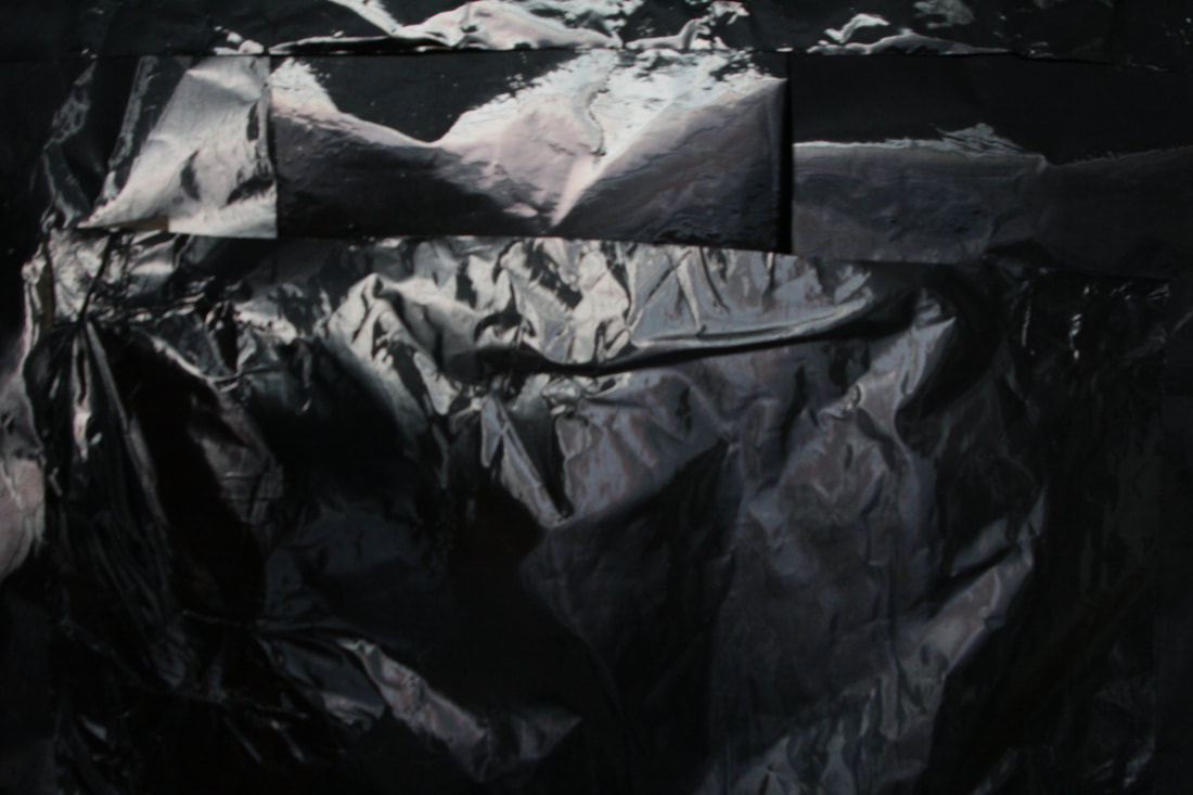
Worn out.


Patterns.


Three themes.
Stand out.
Reflections.

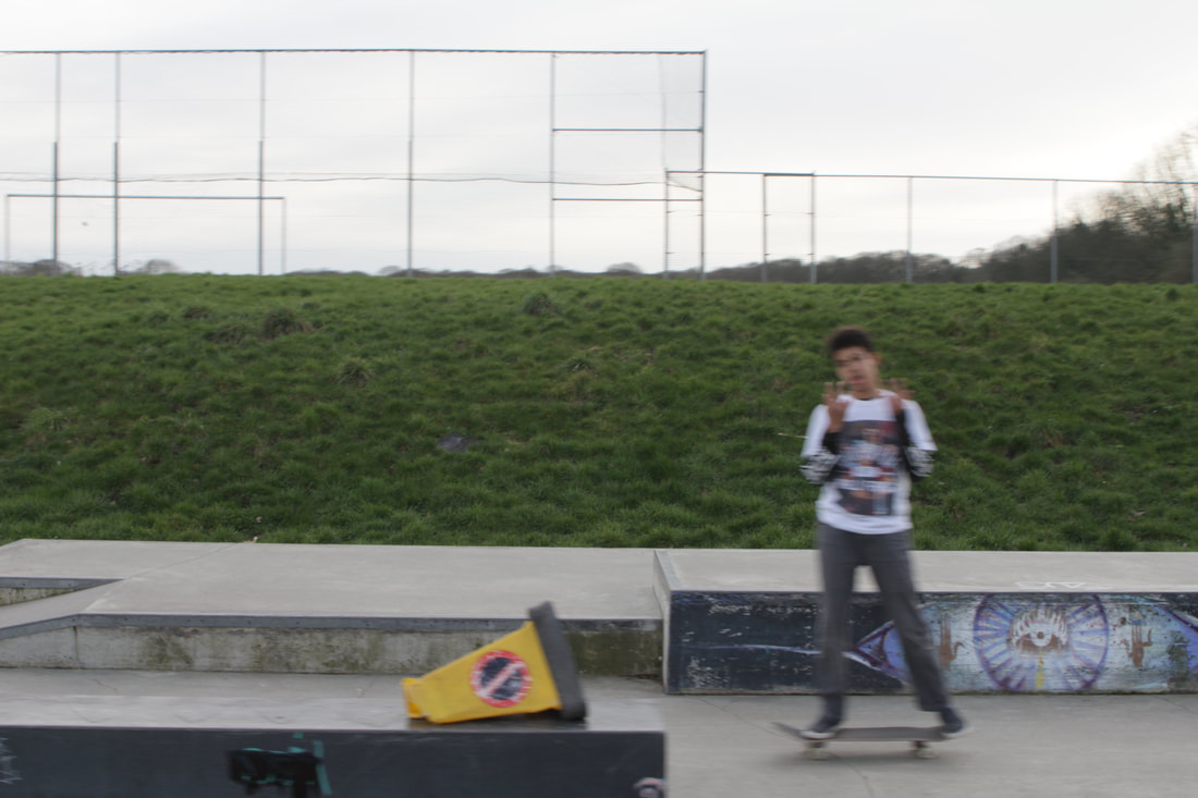
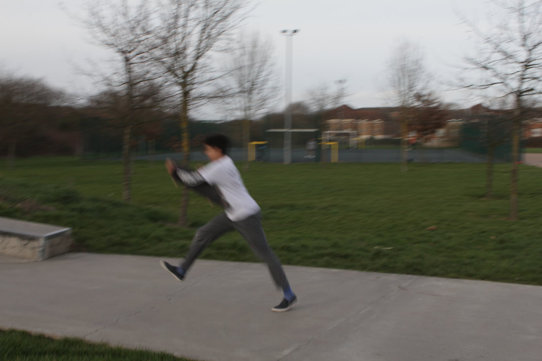
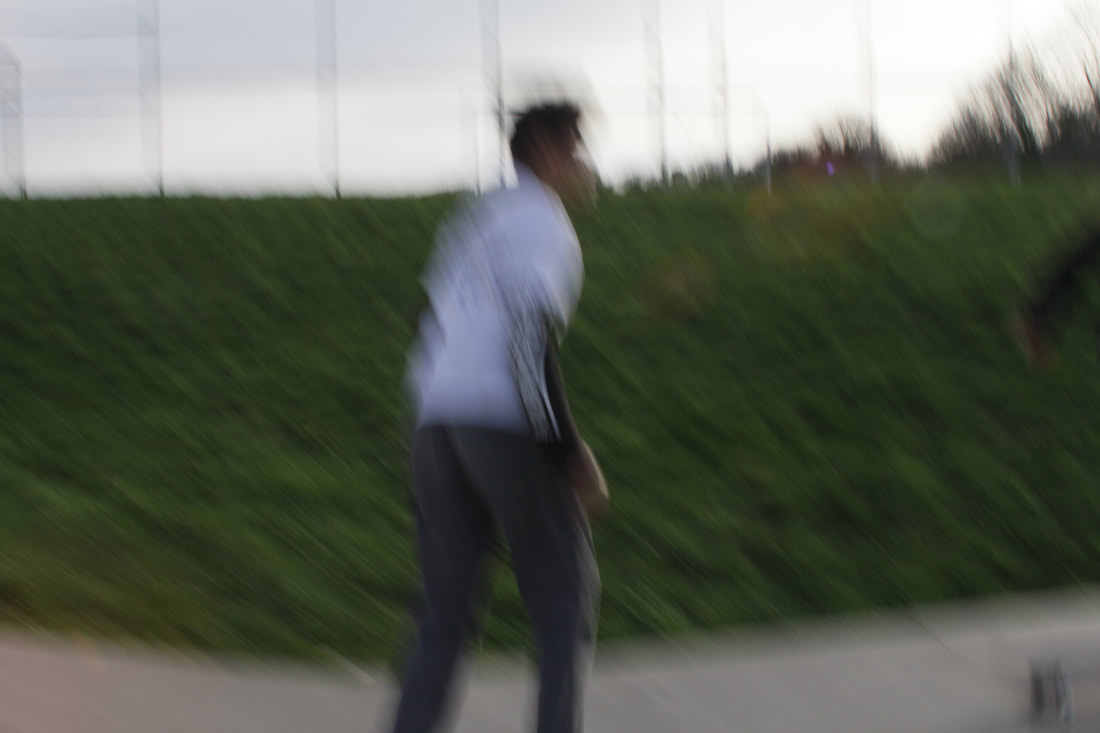
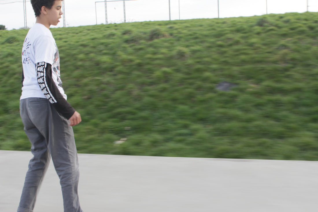
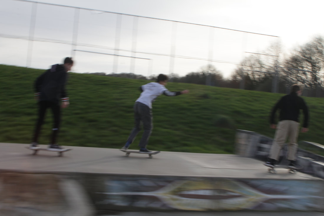
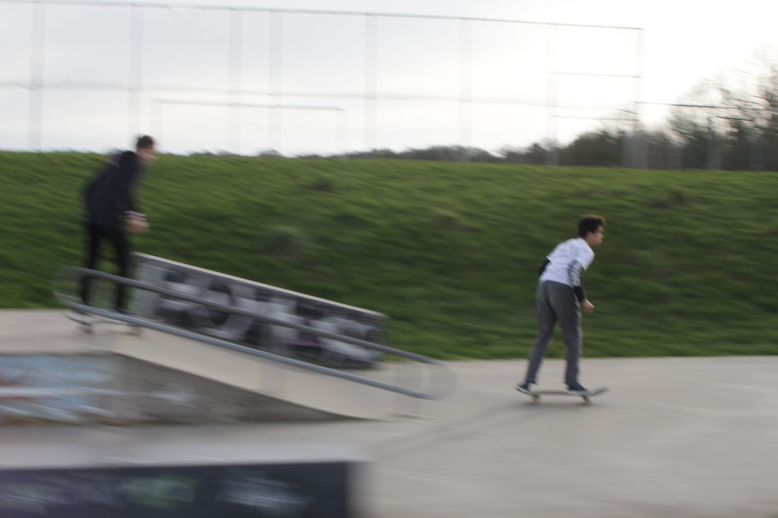
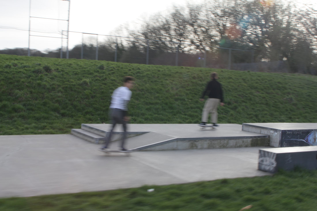
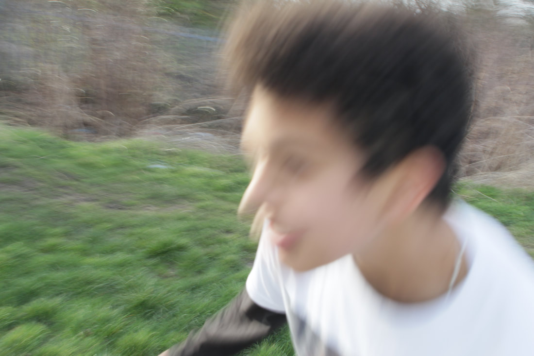
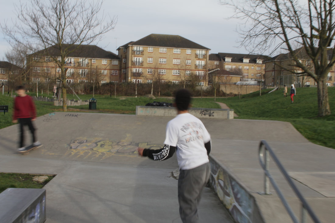
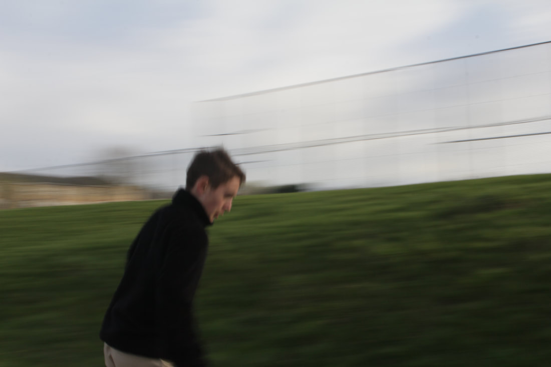
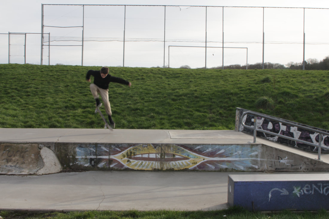
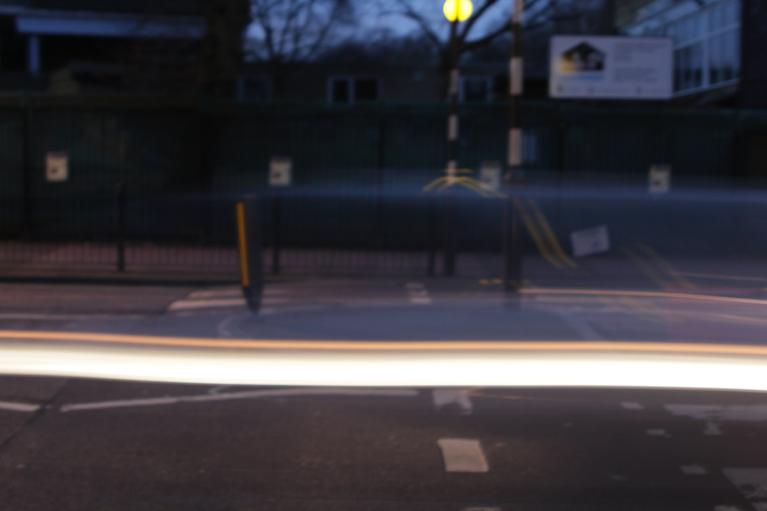
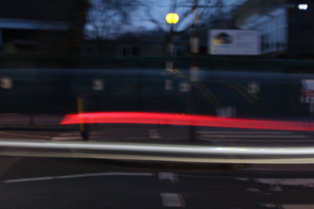
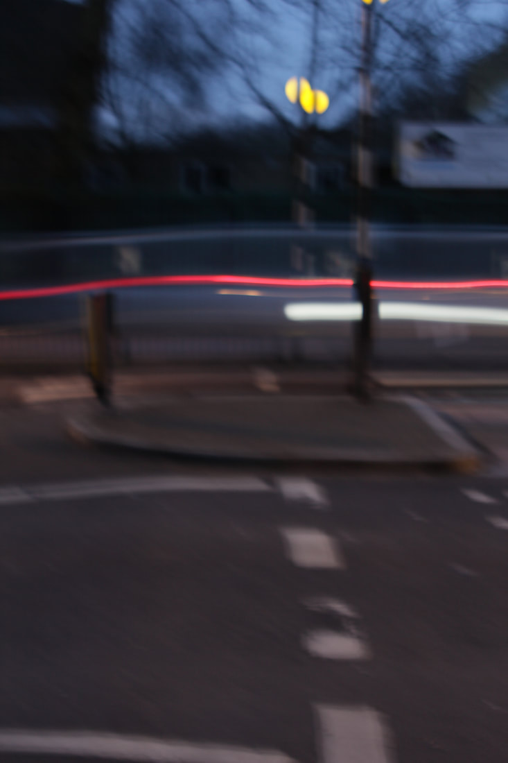
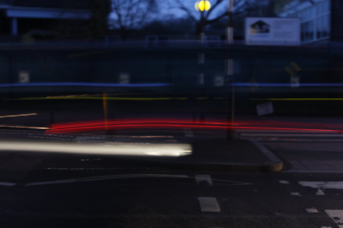
Blur.
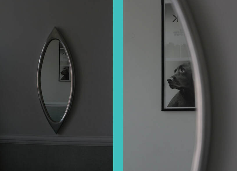
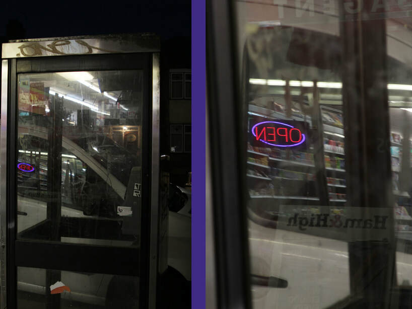
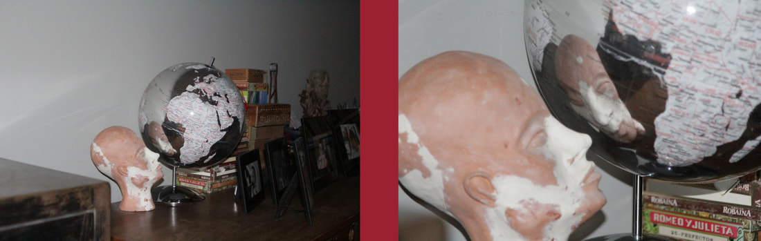
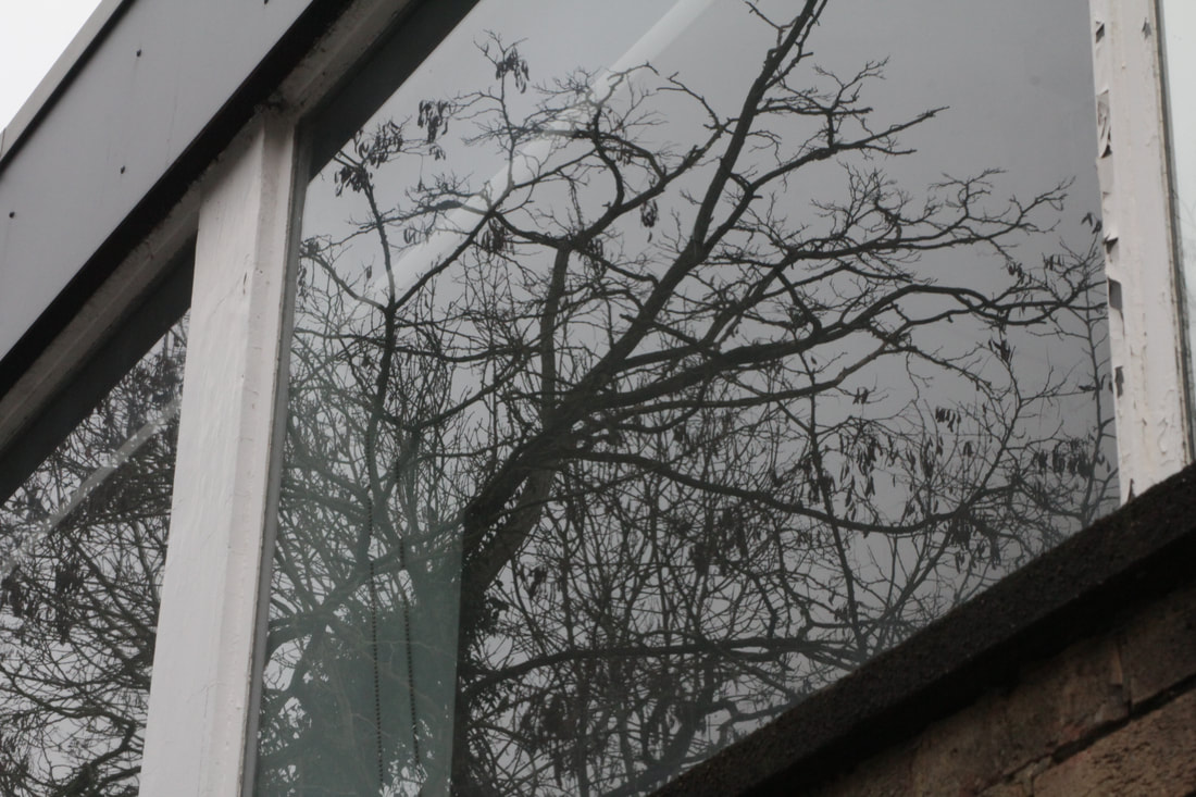
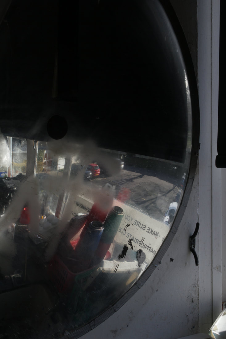
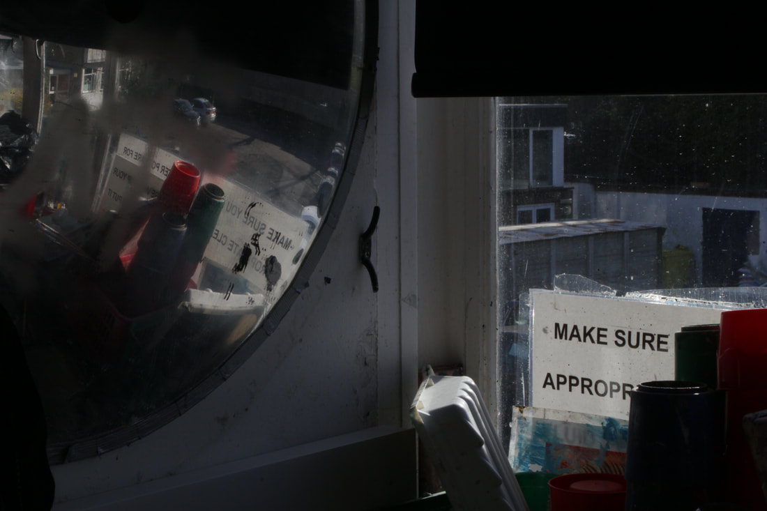
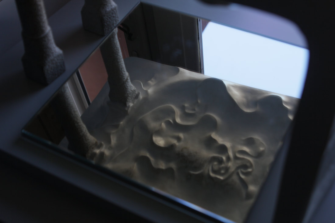
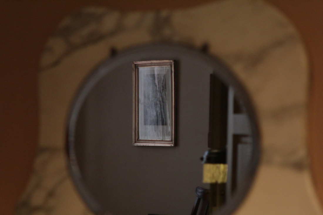
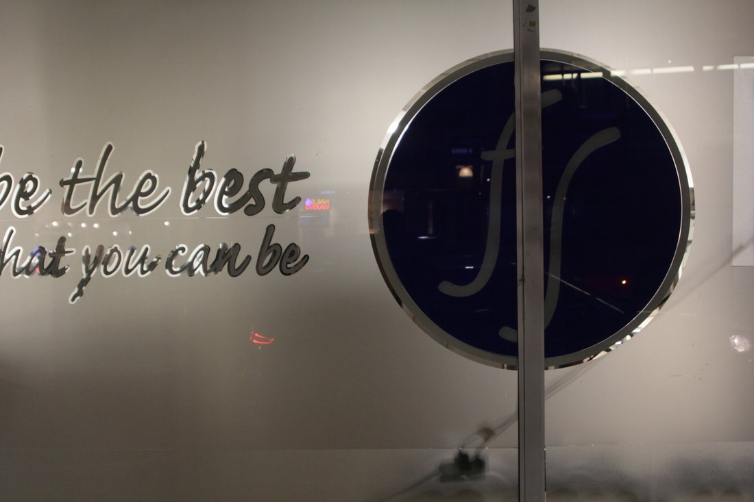
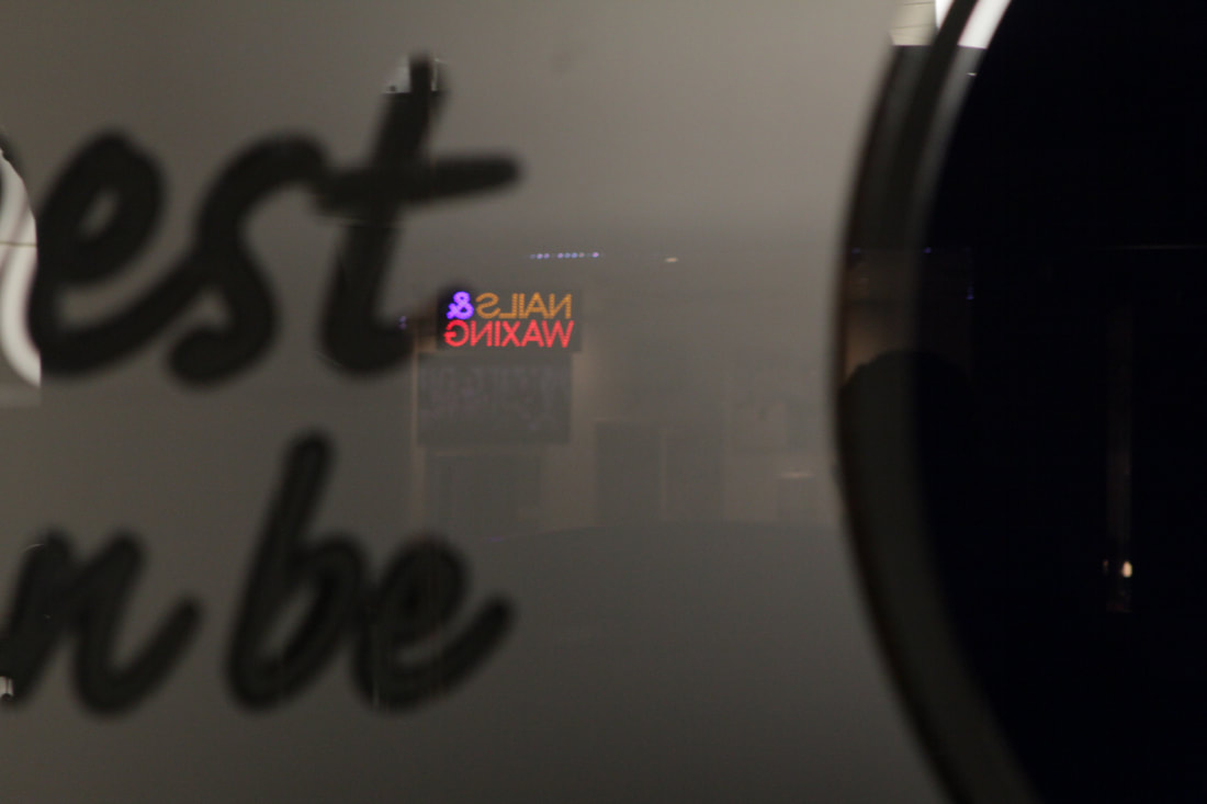
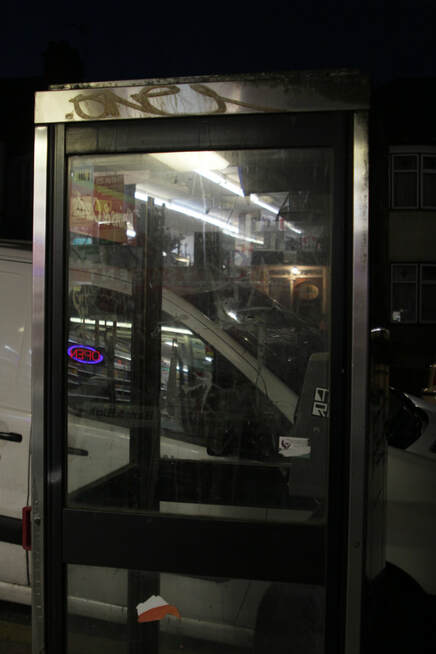
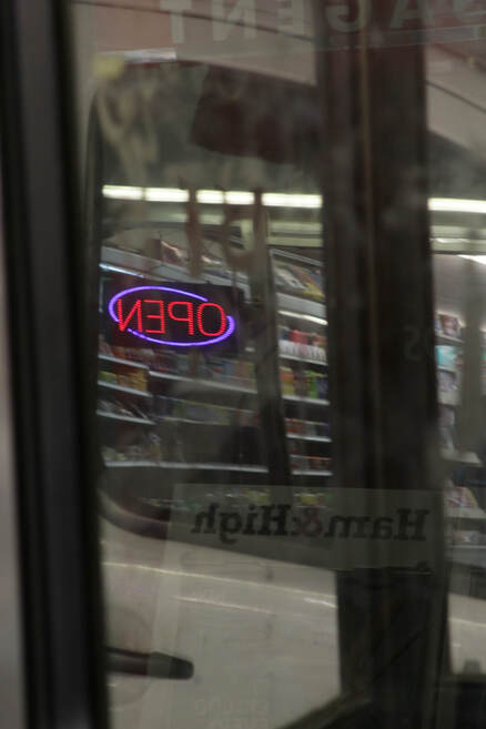
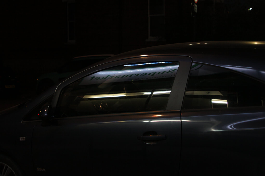
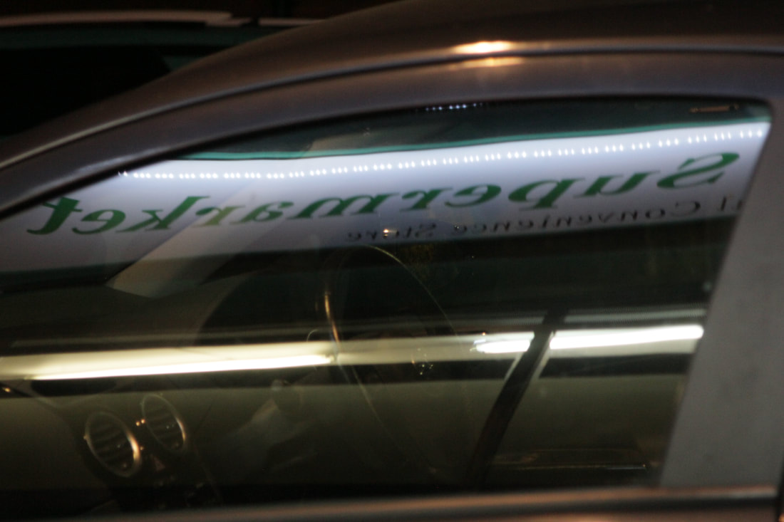
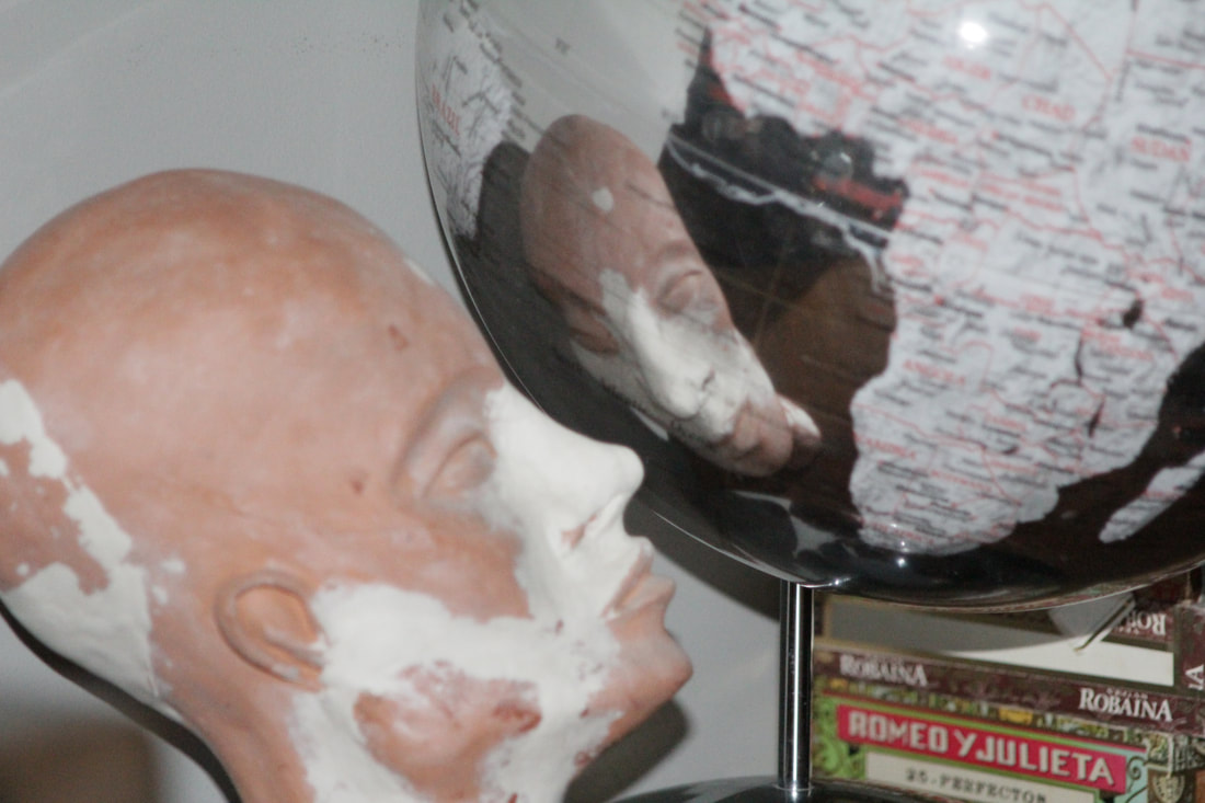
Favourite theme: Reflections.
The theme I have picked for this section is reflections. I used

|

|
|
|
|
|
|
|
|
|
|
|